By Phil Mackintosh
Data collection is no justification for increasing investor costs.
There are plenty who call for the industry to be more “data driven” with market structure reform. But ever since SEC Chair Mary Jo White started to talk about this, what we’ve seen is data collection rather than analysis.
The SECs Tick Pilot is a case in point. Designed to deepen liquidity on the NBBO by widening spreads, the pilot was widely regarded as a costly failure. That’s mostly because artificially widening spreads added costs to investors, estimated at $300 million to $900 million, despite the pilot impacting just 2.5% of market liquidity.
But alas, before the tick pilot data has even finished being collected, we have a new Access Fee Pilot – which is also expected to widen effective spreads and reduce liquidity at the NBBO. What that should prove is that data collection alone doesn’t help design better pilots.
Golden Rule: Do No Harm
U.S. Equity markets are the cheapest, most efficient and also most transparent in the world. Our primary focus should be to protect those advantages—and do no harm.
Thanks to that transparency, we could start by using the data we already have. Did you see that FINRA recently boasted that it collected an all-time high of 135 billion records in just one day? Even more impressive, FINRA recently used that data to compute opportunity cost, something we recently said was lacking from the Access Fee Pilot proposal.
This is important as it confirms we do already have the data required to identify routing conflicts and quantify opportunity costs. Sadly the final Access Fee Pilot ruling did not quantify any benefits—although it does quantify costs—if you’re interested, start at page 222.
What the Market Tells us about Tick Sizes
Even simple data can tell us a lot about trading economics.
Let’s start by plotting all corporate stocks across price, spread, depth and market cap (Chart 1) and see what we can learn.
Chart 1: Spreads naturally widen as market cap and liquidity fall

Artificially wide spreads increase queue size
The upward sloping diagonal line shows how the 1-penny tick forces spreads wider as price falls. Note that the largest circles (depth of the NBBO or queue length) generally sit on this line. This shows that once spreads are capped, the trade-off between the cost of crossing a spread and the cost of waiting swings in favor of waiting—leading to longer queues and time to fill. These spreads are “artificially expensive” or “tick constrained.”
The second diagonal line supports this conclusion. Those are stocks in the tick pilot (the pilot ended on Sept 28, 2018), where a 5-cent spread was “artificially expensive,” incentivizing rational traders to capture spreads regardless of the longer queues that created. Note that these are the same stocks that cost investors between $300 million and $900 million above.
Artificially high prices have worse spreads, too
Higher stock prices reduces the “cost” of a 1-cent tick (in % cost). But data shows that having a stock price that is so high that your stock is no longer “tick constrained” isn’t optimal either.
In fact, what you see is that once that stocks lift off the 1-cent spread (diagonal) line, spreads in basis points actually start to rise. For example, tickers like AMZN and GOOG, despite their incredible liquidity, trade with notably wider spreads than other mega-cap stocks priced closer to $100, like MSFT.
This U-shaped curve would seem to indicate that stocks that “just” trade 1-tick wide have the best tradability. If the tick is too small, or too wide, spreads (and trading costs) actually increase.
Liquidity affects the “optimal” spread size
The chart above is also colored by market cap. This shows that market cap tends to cluster around a stock price range. But the more revealing pattern is that the U-shaped pattern persists across each group.
We’d also highlight that the optimal (minimum) spread in basis points rises as market cap falls for:
Mega caps the minimum spread is around 1bps, for a stocks priced around $100
Mid-caps that increases to around 5bps, which happens for stocks priced around $40
Small caps it is around 5bps, which happens for stocks priced around $20
While for micro caps, the minimum spread is closer to 20bps.
This is mostly because liquidity falls as market cap falls—because smaller companies are smaller, they have less capital (and usually shares) to trade.
Liquidity also varies within market cap, which largely explains why stocks trade above the diagonal line (but that’s a chart for another day).
Can existing data tell us about optimum tick sizes?
Using data like this we proposed adopting intelligent tick sizes and intelligent rebates to improve markets and reduce investor costs over a year ago.
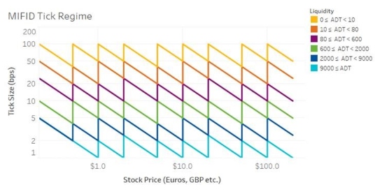
We weren’t the only ones thinking this way. One of the data-driven innovations implemented in Europe was an intelligent tick regime. As the chart below shows, it changes the tick size as both price and liquidity change. That results in:
A consistent minimum spread, in basis points, for all similarly liquid stocks
Which just happens to fall at levels consistent with those seen in our US data too (we’ve aligned both color schemes)
Chart 2: MiFID introduced a data driven tick regime that looks surprisingly similar to how US spreads naturally work
There is much more data out there. The trick is using it.
Maybe then we can change markets for the better, or at least be pretty sure we do no harm.